PROJECT SUMMARY
Hospitals were losing millions to misplaced or stolen equipment, and nurses often wasted valuable time searching for devices instead of caring for patients. With Gozio’s existing beacon infrastructure already in place, we saw an opportunity to solve this problem through real-time location tracking.
I led the design of an interface that helped staff quickly find equipment on hospital floors. After simplifying the map design and testing filtering options with Children’s Hospital of Atlanta, the pilot showed strong usability gains and positive feedback from clinicians.
Goal
Leverage Gozio’s beacon infrastructure to build a real-time location tool that helps hospital staff quickly find and manage medical equipment, reducing lost inventory and saving staff time.
Problems
Financial loss: Large hospital systems lose millions annually due to missing or stolen devices.
Inefficient workflows: Nurses and staff spend excessive time searching for equipment, pulling them away from patient care.
Over-complex UI: Existing Gozio map designs had been optimized for patient navigation, not fast equipment discovery, leading to unnecessary visual clutter.
Contributions
User testing
Information architecture
Wireframes
Visual design
Prototyping
Explorations
Our research revealed two distinct user groups with different needs: nurses and clinical staff, who urgently needed devices for patient care, and central equipment (CE) staff, who managed inventory at scale. Both groups faced significant inefficiencies: nurses reported spending nearly an hour per day searching for equipment, and some even cited delays in patient discharges due to the inability to find a wheelchair.
I focused on two core challenges in the design process:
Challenge 1: How to designing a map to show large data sets
The existing map interface was designed for patient wayfinding and color-coded by department. This system broke down when applied to device tracking, where clarity and speed were critical.
I explored alternative visual schemes that simplified the map and reduced clutter, ensuring devices were distinguishable even in dense environments.

Light color scheme

Mid-tone color scheme

Dark color scheme
Challenge 2: How to helping users filter data to find devices quickly
With hundreds of devices to track, a simple “dot on a map” was not sufficient.
We designed filtering options that allowed users to narrow by device type (e.g., IV pump, wheelchair) and explored ways to surface device status (clean, dirty, in use).

Integrated panel: I explored a visual treatment for filter with all options integrated into one panel. This kept all controls in a single area, allowing the user to expand or collapse items as needed.
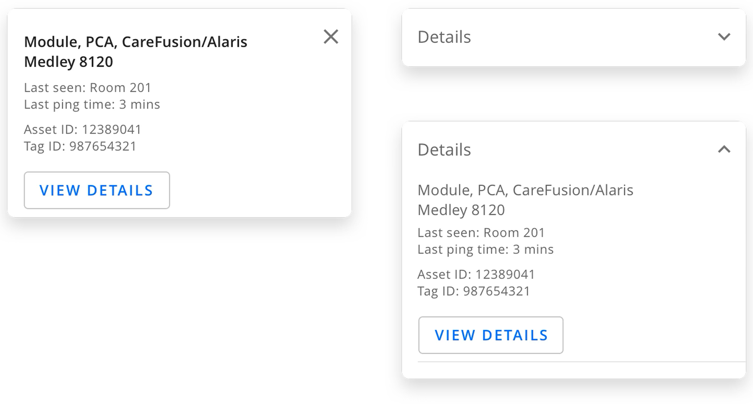
Separated panel: I explored another visual treatment for filtering with separate panels for details and asset types. Users also had the ability to expand or collapse or (in an alternative option), they could dismiss after reviewing a specific asset’s details.
Final Deliverable
The RTLS pilot delivered a streamlined interface for locating equipment in real time:
Simplified maps optimized for staff use, with decluttered views.
Filter and search features to quickly narrow down device type or status.
Iterative releases addressing pilot feedback on accessibility and clutter.

The Homepage provides a view of all assets in the system.
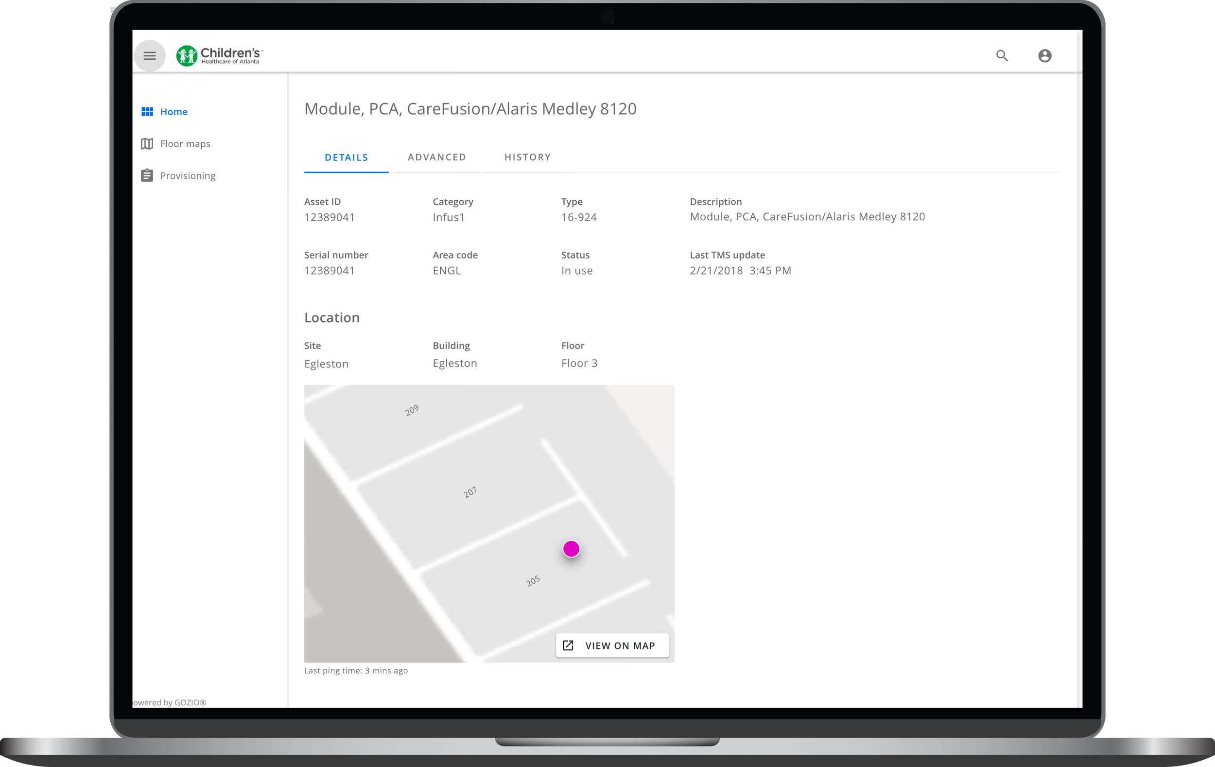
The Details Tab focuses on the most pertinent information once a user has selected an asset from the list view. It also includes a view of the location’s device on the map.

The Advanced Tab on the Details Page provides an all of the details for a given device. This view is intended for the clinical staff (like the central equipment team)

The Map View is intended for nursing teams and helps them see all available devices near them. They can also filter to see less device types. The devices pane is dismissible to allow users more room to view the map.
Results
Both clinical staff and CE teams were able to find devices within 3–5 minutes during pilot testing, a significant improvement over prior workflows.
Users consistently emphasized the importance of device status visibility, which we integrated into later prototypes.
While the simplified maps improved usability, device colors were still difficult to distinguish in varying lighting and conditions, leading to further iterations.