

Refertree
Refertree allows users a way to purchase and manage their subscriptions in a single app. As an added bonus, users can save on their monthly bill by referring friends to purchase from the app. The idea was developed in an internal innovation session at Assurant Solutions.
Goals
Contributions
Designed concept for the redesign (original work handled by outside agency)
Facilitated and grew working relationships with Dev and QA teams
Created wireframes for original concept
Led design QA efforts for original implementation
Create more visually appealing displays for products and flexibility in layouts for featured sections
Simplify checkout process (reduce steps / make it clearer when additional selections are needed)
Reduce clicks to see basic information, like people I've referred and money I'm earning
Resolve disconnect between the app's visual tone and the core audience
Research
Working with the Product Manager, we conducted focus groups on the both the concept and on the app. The session highlighted some usability issues as well as a disconnect between our core audience and the visual design of the product. Additional feedback centered around overly complicated workflows for the main tasks. After hearing all of these issues, we decided the MVP design should be revisited.
User flows
With several solid feedback sessions completed, the product team took another look at our user flow diagrams. We decided to use some of the suggestions from the research to deliver more streamlined flows for our two core functions: purchasing a product and referring new users.


Design
When revisiting the design of the app, I focused on simplifying the interface to ensure the primary user tasks were complete. I also focused on a fresh, clean and friendly take on the existing brand colors in an effort to connect more with the primary demographics. Below you can find a few comparisons on how the interface evolved:
Shopping
The original design lacked a premium experience in the product display. There was also very limited flexibility with product images, which meant an inability feature specific products and sections. For the redesign, I focused on an improved product presentation to better fit the business needs and user desire for a less cluttered and more easily navigable shopping experience.
Original

Redesign

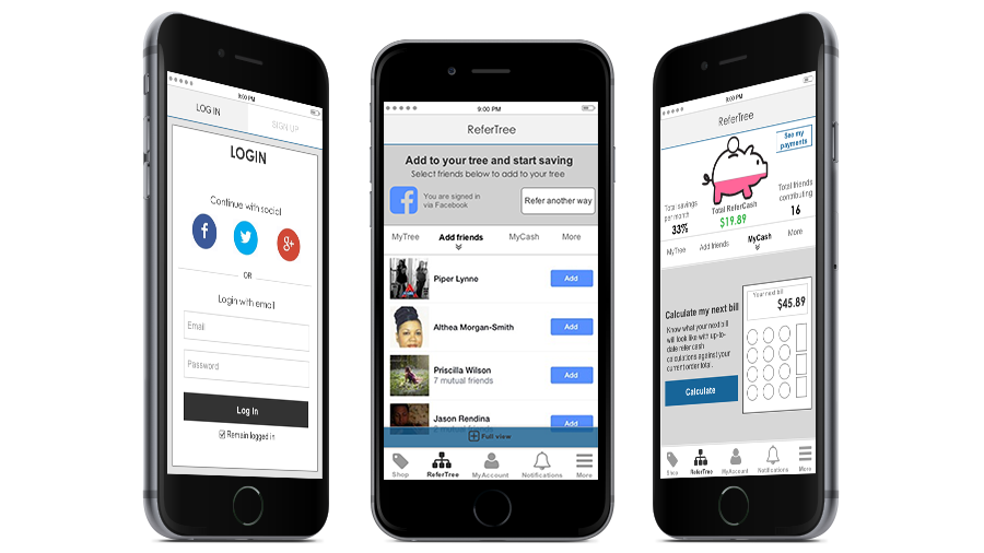
Referral and savings
The original experience used a page-level navigation to create separate, distinguished action areas. User feedback informed us that there was too much segmentation. When redesigning the referral and savings presentation, I condensed these four sections into two pages. The account section was moved to a dedicated section accessible from the main navigation.
Original

REDESIGN

Original MVP
The Goal
The team wanted to create a best-in-class e-commerce mobile application. We primarily focused on the social and purchasing aspects of the platform, as these would be the key to the project's success.
Contributions
Assisted with the creation of the original wireframes
Design lead for the project, managing the implementation and post-launch feature development post-launch
Worked closely with the design agency and off-shore development team to ensure design quality
Redesigned the interface based on feedback from the MVP
Research
The innovation team had completed consumer focus groups to test the viability of this idea. Another member of the UX team and I completed a competitive analysis of top-performing mobile apps in both iOS and Android in addition to reviewing current trends in mobile e-commerce applications. All of this research was used when designing the application and the overall experience.
Limitations
The internal team didn’t have extensive experience in building mobile applications.
Our front-end development team was located off-shore and the time difference often caused delays in the work schedule.
Post-Launch Modifications
Following our initial launch, we identified the need to improve a few areas of the application, including the checkout funnel. In the application's first iteration, we didn't include any shipping options, but for this release, we wanted to give users the option to expedite shipping for some items they might need right away, like a new cell phone. View the Invision demo for our revised checkout flow.
In addition, due to the nature of some of our new partners' products, we had to rethink the way users made selections to customize subscriptions. For one partner, StrengthCrate, we needed to create a new user flow to accommodate size selection and workout preferences in order to be sure our customers receive the perfect products in every delivery. View the InVision demo for StrengthCrate.